OpenDataCommunities is all about helping you, the user, get the DCLG data you want, how you want, when you want. So over the last couple of months we’ve been working hard with our contractors Swirrl to redesign the site and add new features to help you do that more easily. Today we’re relaunching the site with the first fruits of our labour: a new look, a blog, a commenting feature and to come, automatic geographic visualisations of our data.
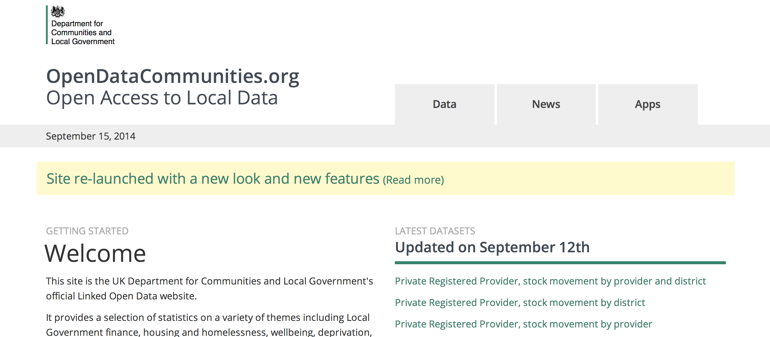
First is the home page. We’ve added tabs at the top so you can quickly browse to the latest Data, News or Apps. We’ve added a blog too, which we’ll be using to update you with the latest developments, set out user guides to different aspects of the site and highlight interesting uses of our data via OpenDataCommunities. It’s also possible to browse to particular topics using tags.
We want to encourage your feedback on OpenDataCommunities and how well it meets your needs, so, secondly, we’ve introduced a commenting feature for each of our blog posts. Try it out at the bottom of this post!
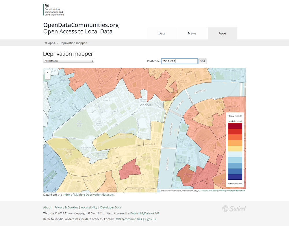
And thirdly, we’ve completely rebuilt the deprivation and wellbeing mappers using open street map data. This sets the stage for a particularly exciting development to come: visualisations that automatically map data. We know from OpenDataCommunities usage data how popular these mappers are with you all, so our hope is that introducing this feature will make our data more accessible, interesting and insightful still.
Finally, our Linked Data platform, powered by Swirrl's PublishMyData, has been upgraded to version 2, which includes many new features for data users. More on this soon.
Take a look for yourself and tell us what you think, either via the Disqus commenting feature below or by emailing us at ODC@communities.gsi.gov.uk.